
I’m writing up my notes from today’s strategic planning session, and I was suddenly struck by the clarity of information design in Basecamp, our project communication tool. This really is one of the cleanest and most elegant user interfaces I’ve ever used.
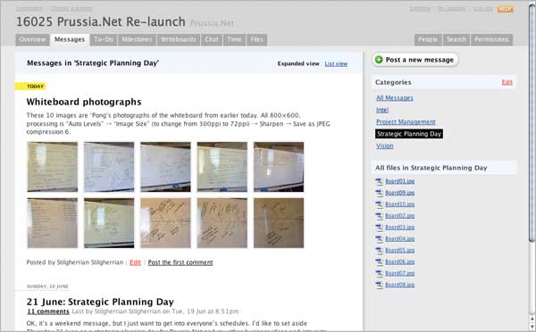
Things of note about this screenshot:
- The content dominates the page, not some loudly-screaming logo or “web page header”.
- The hierarchy of the information is very clear. It’s immediately obvious which label is attached to which object, and what’s more important.
- It’s simple, easy on the eye — so you can work on this all day.
Which all makes it a fine example of Web 2.0 design.
Plus for some reason I really, really love the way the photos of the whiteboard make a lovely abstract pattern.
Have you tried running those whiteboard shots through Scanr? I’ve had some good results with its automatic rotation and contrast adjustment. You email them the JPG, they email you the PDF back.
@Garth: I hadn’t heard of Scanr before, I may well check it out, thanks. But that said, I don’t actually mind the angled images, I don’t really need rough notes looking pristine. Still, I will play…