I’ve decided that each weekend I’ll dig out an object or two from my more distant past and write about it. To kick things off, here’s a challenge which was originally created by the same chap who coined my name.
The text you can see in the image below (at least if you happen to be sighted) is in an unknown script. Your task is obvious, I think.
The only clues you have are that it’s a quote from a book by Ursula LeGuin and it’s nothing whatsoever to do with Tolkein.
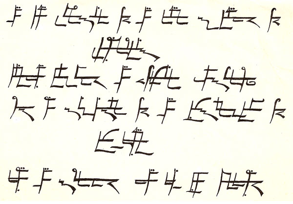
Now originally I solved this in under 2 days, without the aid of computers or amphetamines. I reckon that in The Age of the Internet you can do better. I’ll negotiate a suitable prize for the first person who posts the solution.
I find myself wondering if the script includes punctiation as well as phonemes?
@Kate: Nope, here isn’t anything there in the way of punctuation. In this particular example, if there is a new sentence, it would just start on a new line.
Am I looking at it correctly, then, in that there are three sentences total?
@Aaron (bornfor): If I remember correctly, that is true, yes. I’m only hedging that answer because my source material is in storage and I’m relying on my memory.
I’m onto it. Slow but getting it. The double dots are the most mysterious parts but I’ve found some charts on the net that are helping me decypher the straight & curved lines. I think I probably know what you mean about the “sound” aspect of this code- when I looked at some of the really squiggly bits I recalled seeing something like it that my mum used to do, but she never taught me how- grr…
I’ve gotten them all broken down into what I think are the various ‘characters’. They’re relatively consistent, so it wasn’t.. awful.
My one confusion with this is the same as @Murfomurf was saying- the dots. I have them classified as numbers. Number two goes 2, 2a, 2b, based on the dots, etc.
@Stilgherrian, I know you’ve given vague hints before, but would you mind hinting *once more* about how you’ve altered the alphabet? You said it was minor, but does ‘minor’ imply that the alteration was only for vowels or consonants- or for a small number of both?
I ask because I’ve gotten ‘spaces’ written out already with each character’s temporarily-assigned number, but am unsure how to proceed from here.
@Murfomurf and @Aaron (bornfor): Having just written an icy-angry response to someone else’s comment, I feel the need to re-balance my karma by giving you three hints.
These may or may not help.
This is fun.
Alright, here’s my proposed list of characters.
https://docs.google.com/drawings/d/1g6j7-PVi7C9VwOarvJZE9zIjTOsMt6JBzkBdB7oRiO8/edit?hl=en_US
Murfomurf, were you getting something similar?
@Aaron (bornfor): I like your chart so much I’m going to embed it here on the page so people don’t have to click through.
I like the blue baseline. What would that be called in other contexts, I wonder? But my mind wanders…
I am assuming that each glyph is a word. It seems that most have drawn that conclusion.
No one seems to have mentioned the fact that the centre line is not drawn from the start to the end of all “words”. It may not be relevant, but it seems that a horizontal line is present in all “words”, but there are breaks in some.
Is the break symbolic of syllables? L1G3, for example, starts with a character (without the horizontal), then a series of characters (with a horizontal), then a break to the next series of characters (with a new horizontal).
I would also like to explore the idea that the horizontal line actually splits a vertical line in two – in the image above, number 5 is not 1 vertical line, but actually 2 – one above, one below.
Unfortunately I am as yet unable to do anything to develop these thoughts further, but wanted to share to see if anyone had an opinion on them.
One thing I haven’t noticed much about in the comments so far, but which may hook back to some early clues: if it is English written in an alphabet, nothing says it is written in a direct analogue to the *current* English alphabet of 26 characters. There are, after all, 44 phonemes in English, and some of those currently represented by pairs of graphemes were at one point represented by single graphemes that are no longer in use (for example, the “thorn” character used in Old English) or as ligatures (the “ae” ligature rather than an “a” followed by an “e”). Jason L. did touch on the latter with the comments about languages whose characters appear to have line-linkages, sort of, and ligatures serve(d) the same basic purpose in English, albeit usually being a typographical convention.
Since the main place that I have seen either of these written out is in older English, which was Tolkien’s primary subject of study as a linguist — especially the thorn case — it seems plausible that attempting to do a character substitution against English written using some or all of the possible variations if you include older characters and/or ligatures might result in a more productive analysis.
Or it could even be as simple as a true phonetic alphabet for English, in which case you need to use a slightly different form of the classic frequency mapping, as several of the high-frequency characters actually have multiple phonemes associated. I don’t know that I’ll have time to delve into it, but some thoughts in case anyone else cares to try the tack.
My working assumptions, wrong as they may be:
1. The “clearer” spacing is handled at least roughly as in English: to wit, it designates word boundaries. The “one word per line” just doesn’t make sense to me; it would produce a quote that is far too short for most of the significant things in LeGuin’s work, and there is far too much complexity within a single line for it to realistically represent one word in something written in English. Welsh, perhaps, but not English. 🙂
2. The “disconnect spacing”, such as that seen in the third grouping on the first line, does *not* indicate a word break. It may or may not indicate a phoneme break or a syllable break.
3. There is a mapping to either the full IPA or the set of 44 English phonemes, though given that it is a text from English, presumably the English subset of the IPA would be sufficient.
4. There is probably significance to the repeated patterns that appear in different compositions, such as the frequently-seen vertical stroke with a cross-stroke at the top and one or more dots, which appears in both of the first two groupings, the second time with a diagonal linkage, which is then itself repeated *without* the lower portion in the middle of groupings later in the same line. There is also a rounded-linkage variant that appears multiple times later on.
4. That blue line is actually positioned as a midline (or centerline). A baseline generally occurs lower down; roughly around where the left horizontal stroke on the opening grapheme appears, running just below the “leftward V” on the last grapheme of line 1, etc.
5. Beware the serifs. The original appears to have been done using a calligraphic style, possibly a classic ink pen, evident in the smoothly-broadening strokes and small “tails” in some spots that run exactly across the end of the stroke. See the opening of the third grouping on the last line for a very clear example of this. Details are important, but not *all* details necessarily have the same importance. Anyone know if S. is right-handed? The angles are roughly correct for a right-handed person writing in a classic humanist style (with the nib at a 30-to-45 degree angle to the vertical of the writing).
6. The comment S. made highlighting the two dissimilar corners (sharp vs. rounded) is more obvious if you have an understanding of the physical strokes used to produce the two types with a nib pen: assuming a right-handed writer, the sharp form goes to the left at the base of the stroke, then comes back across to the right, while the soft form goes directly to the right and probably involves a slight (possibly not entirely comfortable) twist of the wrist and fingers to keep it from producing an excessive ink blot or having a strange “wobble” to it.
7. Some of the “connective tissue” may be optional; the same character appearing at the start or end of a word may have different components than when it appears in the middle of a word. Consider classic English cursive writing for an example of this.
8. It may or may not be relevant, but the Old Speech from which Hardic is derived was (is) the language of *dragons*. Hardic is the human adaptation of it. The nature of a stroke or dot may have to do with how someone would imagine them being written by dragging or tapping/pressing with a claw, rather than a pen or a human hand. Alternatively, if inspired by runic languages, it may have the same sort of thing going on in a different way.
@Joel: That’s a glorious set of working assumptions, containing little that’ll lead you astray. I’d been wondering whether to point out that this is a copy of an original that was done with a nibbed pen, replicated as best I could with a fibre-tip or similar. I am right-handed. There is no need to invoke dragons, or similar.
Hello. I’ve reached this site some days ago, following the Google name policy rant. It’s a shame this script challenge is still unsolved after all these years and with all these clues, so I am trying my hand at it. My considerations so far are the following:
1. The text reads left-to-right, top-to-bottom, just as most Western scripts. I take this for certain, because penstrokes were clearly drawn that way. The centered text of lines 2 and 5 make it look like a title page, which would be an enormous clue.
2. The text is made up of 29 words, which can be identified by whitespace as per @Joel’s assumptions 1 and 2, which are completely correct in my view. In the following figure I have placed each word in a green-bordered box. Maybe this breakup is not completely correct. but I’m confident it mostly is. The first word is also the most frequent (5 occurrences) and my guess is that it represents the article “the”. The fourth word occurs 4 times, and it’s probably a preposition (of, in, on …)
3. The most prominent feature of the script is the line (code named “blue line”, painted in blue in my figure) which appears in every word and is sometimes interrupted. I’ll call “ascenders” the strokes above it and “descenders” those below it. Even if a long slash as the beginning of L1W2 really is only one pen stroke, I will analyse it as two strokes, an ascender and a descender. These are standard typography terms. A unique feature of this script is that, while descenders can live either with or without a blue segment above them,
an ascender always requires one. The reverse is not true: in two instances, L1W3 and L6W4, blue segments start without being triggered by ascenders.
4. In almost each case where an ascender and a descender are drawn one above the other, possibly in one pen stroke and probably as part of the same letter, one of them is “more complicated” than the other. This prompts me to classify the candidate letters of this script into four groups:
(i) strictly negative: consisting of descenders only. These are the only letters which can live without a blue segment. All other categories require one, because they involve ascenders.
(ii) extended negative: descenders, with an additional ascender (a simple vertical segment)
(iii) strictly positive: ascenders only (a rich inventory of hooks, loops, dotted variants…)
(iv) extended positive, the same as (iii), with an additional descender, which is a vertical segment (sometimes with a dot)
5. Where do I put the simple slash which begins L1W2? It is an extended positive to me, because this script does have ascenders consisting of a single vertical stroke, while I don’t see descenders of this kind. If this is not clear, never mind, it’s only an attempt to rationalize impressions. I might be wrong with this detail, but I’m after an overall picture now.
6. What is urgent now is to break up words into letters, and identify which letters are instances of the same character. My attempt at the first step is this figure, where letters in odd positions appear red, so that they can be distinguished easily from letters in even positions (positions are relative to words). To point to an individual letter I’ll use a notation like L1W2.1, as in the assertion: “L1W2.1 (the first letter of the second word in the first line) is almost certainly an instance of the same character as L2W1.2” (an assertion I hold to be true, BTW…).
7. I have two more pictures. In the first one I erased the blue segments altogether. This is clearest to my eyes when it comes to splitting words into letters, but in this way some information is lost, because I don’t know any more which strictly negative letters had a blue segment above them, and which didn’t. So here is fig. 3, where only blue segments above strictly negative letters are drawn.
8. What about L1W1.1, a horizontal descender with no blue segment above it? Is it a separate letter or part of the extension descender of L1W1.2? I’ve decided for the former, but since it appears only in this one (frequent) word it could also be a special abbreviation, so I don’t care much.
9. I’ve analyzed the initial squiggle of L1W7 as a ligature of two letters, because I think I have instances of those same characters elsewhere in the text, while there are no other instances of the ligature. Again, I might be wrong. Such uncertainties are normal.
10. This post is already too long, and I have still many more observations about the graphic features of this script. I will post them in the near future (I hope), together with my character count, that is, my guess at which letters are instances of the same character, to estimate how many characters are in the script. What is certain is that this script has internal structure: strict characters have corresponding extended ones, dotted characters correspond to dotless ones, and so on. This means that even if not all characters of the script are represented in this text, I might figure how the missing ones
look like. And even before actually counting, I can tell that the number of characters could be much higher than the 26 letters of the English alphabet.
11. So this is my final consideration by now: the script is either an alphabet or a syllabic script, a static encoding (or simple substitution cipher, if you like) of something which is probably not ordinary English spelling: this would be the case if the number of characters was 26 or less. It is more likely that the script is a way to spell English phonetically, just as Deseret or Shavian are, with all complications of the case: phonemic inventories differ greatly across the English-speaking world, but in any case we need an alphabet with at least 40 characters, as the one we are dealing with here, according to my count. It might be a strict transcription of Danny’s presumably r-dropping Aussie accent, or an attempt to picture some kind of abstract pronunciation standard. What is more important, it is highly possible that the internal structure of the script, or only its least aesthetically motivated parts, maps to the internal structure of either syllables or phonemic inventories, or both. This happens in Tengwar, in Shavian, in Hangul, Ethiopic, Inuktitut and many other scripts.
More soon!
I’m intrigued by this script challenge, but I fear my lack of ability will leave me stumped. There are a lot of comments here, and before I attempt to decipher this text, I felt that I had to come up with my own assumptions first. Based on what has been said so far, have I extracted the following statements correctly?
1. This should be a simple translation. You noted that it is simple “beginner material”
2. The script translates to English, but not in the form in which we currently use. (Perhaps Anglo Saxon English – 24 characters)
3. The dots indicate a vowel, or the placement of a vowel
4. The “glyphs” represent a sound rather than just a substitution to a different letter
5. There are 3 sentences
6. There is no punctuation
7. There are no numbers
I hope people are still interested in solving this. I realise that I have a lot to learn on the subject so apologies if my comments appear ignorant.
@Alex Holsgrove: I know as much as you, but I’d like to comment on your points, just to clarify my own ideas:
Yes. Confirmed by Stil several times in this thread.
Yes, Stil wrote it’s a quote from Ursula K. LeGuin’s work, in English, but “not strictly a letter-substitution cipher” and what you write satisfies both hints. However I don’t agree with
This was indeed mentioned in one comment but Stil didn’t confirm it (nor denied). I don’t think that the encoding process involves translating LeGuin into Anglo-Saxon, nor adapting modern English into Anglo-Saxon spelling. As many have written before (including me), a phonetic rendering is more probable. Read answer to point 4 below.
This was mentioned, neither confirmed nor denied. I am not working in this direction. You can if you like.
This is a possibility and I am working in that direction. Truth is, we don’t know yet.
This was also mentioned and not confirmed. Stil hinted that “In this particular example, if there is a new sentence, it would just start on a new line”, so maybe there are 6 sentences, one per line. Or, the whole stuff is a title page with no proper sentences…
Yes. No punctuation. Confirmed by Stil.
Nobody mentioned that before. I’m in fact working as if there are no numbers, but who knows?
I noted the repetition of the first word, but I believe it may be 4 occurrences and one *similar* glyph: the left portion of the horizontal stroke on L4G5 appears to have a “sway” (as in “sway dash”) rather than a straight stroke. Obviously this *could* just be an artifact of the reproduction, but since similarly minor variations have been previously hinted as being important distinctions…
I toyed around with the first word being ‘the’, but it just doesn’t feel right. The structure, and the ways in which it appears elsewhere, make me think it is probably a single phoneme, which pretty drastically reduces the available options. This could be way off base, however.
One idea I toyed with is the possibility that the glyphs have some relationship to the actual *glyphs* of the IPA. In particular, the single-high and single-low dots might relate to the primary and secondary stress markers, placed on the right-hand side of the glyph rather than before it as the IPA does — especially since in some American English dictionaries, the stress marker comes *after* — and a break in the horizontal line might equate to a syllabic separation marker. Alternatively, the double-high-dot might be a primary stress, single-high-dot might be secondary stress, and a low dot might be a syllabic consonant?
Just noticed, while looking at the possibilities of that, that there are only two cases where a low dot happens *without* at least one high dot, and both of those have “crowded” upper areas… but that feels too complex. Real scripts don’t generally move indicators around, and if it were a “displaced” single high dot then there would be no reason to have the “single high dot with low dot” that shows up at least twice. Interestingly, both times *that* pattern appears are on the same base glyph, which appears alone with a single high dot as L4G2. In any case, given the pattern of usage I strongly suspect the dots to be diacriticals of some sort, rather than part of the “base” glyph.
In fact, L4G2 almost *has* to be a single phoneme, and since it is also a full word, that rather drastically limits the possibilities. My guess based on the notion of “glyph shapes being related” would be [‘ai] (sorry, I couldn’t figure out if Unicode had a proper representation of this) with the “left rounded bit” coming from the a and the vertical stroke from the i, but there are other possibilities as well.
The same theory might lead to L1G4 (probably the second most repeated grouping) being read as [ʃʌ] (“so”), derived by shortening the “leading tail” on the first glyph, rotating the second glyph 90 degrees counter-clockwise, and adding a midline stroke to indicate that they are a single syllable.
Again, this could be way off base; there is nothing saying the script has any *gylph* resemblance to IPA or any of the other common phonetic alphabets, it is just a theory I tinkered with that produced a couple of plausible mappings.
Another thought that just struck me, though it *really* may or may not be significant even if correct: in general, calligraphic forms for letters start near the upper-left, sometimes with a ‘curl’, but then proceed either downward or rightward. L4G2, however, appears to be a continuous ‘flowing’ stroke connecting both the vertical and horizontal strokes through the leftward circle. So either Stil’s hand is *very* good (able to lift the pen and reset to the ‘starting position’ without producing any blotting due to excessive ink on a stem that is very narrow *and* lining it up pretty much perfectly with the curl) or this is actually a single stroke changing from vertical to horizontal through the curve.
The latter explanation would be much more typical of a handwritten script, but it implies that either the vertical is a *rising* stroke, or the horizontal is a *reverse* (leftward) stroke. The possibility of it being a rising stroke is only significant if the script *is* based on ascenders and descenders affecting things, which I’m not convinced of, and then in the context of “what if ascender/descender involves the stroke itself, not the position relative to the centerline?”
Otherwise it is just an interesting quirk of the calligraphy system for the script. Stil, any chance you remember whether you were trying to ‘trace’ it from the prior copy, or actually ‘write’ it out in your own hand (i.e., did you focus on replication of the original image, or of the writing pattern of it)? Just for my own curiosity. 🙂
Oh, and now I’m wanting to define a font file for it, dammit. As if I didn’t have enough to fill my time…
Welcome to the new participants! Just a quick comment today, to clarify a couple of things being discussed.
Toying with the possibility that L4G1 and L4G2 are formed based on the “vertical stroke with a left closed curl at the top” being ɪ, the “zig-zag” at that particular spot being Ê’, and the “horizontal stroke across the top” being ɾ, so that the two groupings are “ɪʒ ɪɾ” (“is it”).
Part of the idea being the combination of hints about it *not* being a cipher so much as especially flowery/fancy calligraphy for an alphabet. I’m assuming the IPA for lack of anything that seems to fit better, but if anyone knows of something with a better match, speak up!
Joel, you seem as hook as I am now. Over the weekend I made a start on removing the “mid-line” and extracting each glyph (forgive my terminology) – so I am slowly building a collection of large glyphs, those above the mid-line and those below.
I’m pretty sure it’s not a simple substitution of letters, but I’m quite keen on the idea of substitution into phonetics. Because it’s only 3 sentences, I don’t know how well a frequency-analysis would work. Do you think that would be forth pursuing?
Any thoughts on the dotted letters? I translated the Thai that Stil posted “Liver, sweet and very tasty.” – I had to remove the exclamation mark to get it to translate.
@Joel: I think the key to the comments about it not be a cipher but an alphabet is that a cipher is intended to hide meaning while an alphabet is intended to make meaning clear. Yes, I realise that’s a category error of some kind. But there is indeed a certain logic.
@Alex Holsgrove: In a short text, frequency analysis can only get you a little way, yes. But then you might wonder what things are similar to other things, and why.
Transliterating ตับหวานà¸à¸£à¹ˆà¸à¸¢à¸¡à¸²à¸à¹† phonetically gets you “tub waan aroi maak”. Tub waan is a spicy sweet liver salad from the Isan province of Thailand, and one of my favourite dishes. The word “aroi” means tasty or yummy. And “maak” adds “very” or “many”. So this sentence is how you’d compliment the chef. “The tub waan is delicious!” I have used this sentence many times.
Clarifying my thought about cipher vs. calligraphy:
A cipher can be “secret writing”, but it can also be properly used to describe any transliteration, even just going from one alphabet to another. For example, saying 0x63697068 0x65720000 is a cipher for “cipher”, even though it is a trivial 1:1 in-order mapping of the ASCII values into hexadecimal. Then again, saying it as 0x83899788 0x85990000 is also a cipher, but is probably rather significantly less obvious to most folks (me included). Figuring that one out is left as an exercise for the reader. 🙂
By comparison, calligraphy is an ornamented or decorative rendering of a glyph from any alphabet, which I suppose is technically orthogonal to the question of whether something is actually a cipher. Calligraphy may go so far as to rearrange portions of the glyphs somewhat, though that isn’t all that common, but I was assuming that it may have been done to at least some degree in this case.
However, *encryption* does in fact require that the encrypted form be unknown to all but a small group, as the “crypt” root in this case means “hidden”. Encrypted information pretty much requires applying cryptanalytic skills to extract meaningful-to-the-public information from it. If using a 1:1 transliteration (whether that’s 1:1 by grapheme or phoneme), the line is very blurry and basically boils down to “is the alphabet in question sufficiently common or obvious from context that the audience could be expected to know it or readily find it”. So, for example, something based on the IPA (or any of the alphabets that are well known and can encoding English phonemes) would not be encrypted, since we’ve been told that it is “plain English” and almost certainly phonetic, while a transliteration using the “dancing men” cipher would be an encryption, or at least bordering on it — it would depend on how much of the audience would be expected to recognize it and know where to find the key for it.
All of that said:
The approach I had been toying with involved assuming that the message was written out in IPA or some close kin (definitely not a cipher in the “secret” sense, though certainly not many folks can sight-read it without a reference; I certainly can’t), but written using a calligraphic style with some additional items like the mid-line. I haven’t decided yet whether this is actually going to bear fruit; it definitely leads to coming up with several possible substitutions in short order, such as the ones I discussed in previous posts, but there are a lot of pieces that I haven’t been able to pin to much of anything yet.
My basic approach was to look at some of the shortest groupings, especially ones that were either repeated stand-alone or repeated as parts of longer groupings, and try to map those as a “hook” into the rest. The idea being that very short groupings represent words that can only have a couple of phonemes, at most, which both drastically reduces the number of possible phoneme combinations that could go into it, and *very* drastically reduces the number of English words that they could possibly form. English actually has remarkably few one-or-two phoneme words, as far as I can come up with, but several of them are very commonly used ones, which makes sense.
My approach to the dots was to assume that they mapped in some fashion to the modifiers for IPA (reduction, primary/secondary stress, one other I’m spacing on at the moment), and given the positions that they were probably being treated as diacritics (composed *with* the glyph they modify, the way an umlaut is, rather than proceeding it as they do in normally-written IPA). I had toyed with various mappings (double dots being the reduction modifier, since it is two dots, vs. a single low dot being the reduction modifier), but hadn’t come up with anything terribly concrete yet.
Obviously this may or may not be even remotely on base, but if I make the assumption that it is in a completely arbitrary system of writing that was created by the original person who wrote it out… well, I don’t actually enjoy doing cryptograms, generally; I just don’t find them that interesting. So I’m going with the approach that appeals to me, since if I’m right it is satisfying, and if I’m wrong I’m no worse off than if I tried to do it as a phonetic cryptogram. 🙂
@Joel: All that’s quite sensible stuff. I think you’ve gathered the evidence so far into a coherent view of the problem in front of you. I’m not going to confirm or deny individual details, but I will say that there’s very, very little in what you say that might be leading you in a wrong direction. Also, there’s not all that much in this script that’s calligraphic ornamentation.
just stumbled across this. has it been solved yet? what is the prize?