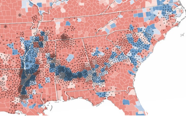
Much has been said of the supposed racial element in the election of Barack Obama as the next President of the United States. This map shows how deep the historical roots run.
The base area map shows in blue the counties which recorded a majority of votes for Obama. The overlay dot map shows US cotton production from 1860 — each dot represents 2000 bales. The similarity of the distribution is uncanny a century and half later.
It’s worth reading the comments on the original post at Strange Maps as people attempt to explain the finer details.

