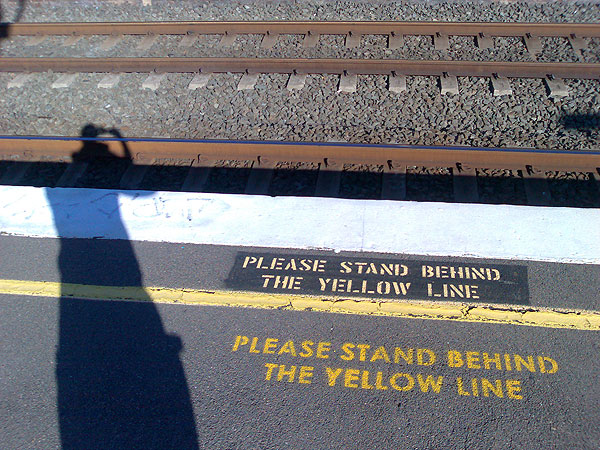
I took this photograph at Stanmore railway station the other day. It was warmer then.

Word-whore. I write 'em. I talk 'em. Information, politics, media, and the cybers. I drink. I use bad words. All publication is a political act. All communication is propaganda. All art is pornography. All business is personal. All hail Eris! Vive les poissons rouges sauvages!
I took this photograph at Stanmore railway station the other day. It was warmer then.
I think it’s good that Australia is the third least likely country to bribe someone, following such excellent company as Switzerland and Norway.
A thought! Perhaps the English guy looking for work could apply to London 2012 as a brand manager.
There really isn’t a polite way of putting it, is there? This new branding for London 2012 (formerly known as the Olympic Games) is a shocker. How did they manage to get it so wrong?
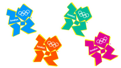
The Sydney Morning Herald headlined their story Olympic logo gets the thumbs down and referred to comparisons with “a disfigured swastika”.
But the Wikipedia entry has the best material so far. A reader of free newspaper London Lite pointed out a resemblance to Lisa Simpson performing oral sex.
A segment of animated footage released at the same time as the logo triggered seizures in people with photosensitive epilepsy. London 2012 removed the offending footage from its website.
I saw a guy’s profile online just now: “29 english need cash/work — ideas appreciated.” Well, mate, what do you think you can do that’s of value to someone else? Give us a clue! “Work” doesn’t just flutter down from heaven, not even under a Coalition government.
I’m exhausted. I’ve just finished dealing with some major systems crises, and at the end of it I’m left with broken formatting on this website. Some of the text looks funny. Oh well it can wait… I’ll tell you all about it tomorrow.