The Rise of Spam
This chart shows the increase in the amount of spam received in the last year or so. From around 1200 messages per month in October 2002, it steadily increased to about double that - 2500 a month - by April 2003. It also shows the massive increase from September through November 2003, which supposedly caused the meltdown of Telstra's email system at that time.
The "flattening-out" of the curve during December 2003 to February 2004 is interesting. Is this the result of the increased attention focussed on spam and its prevention? Or just a seasonal variation, as the spammers go back to normal after a pre-Christmas advertising spree?
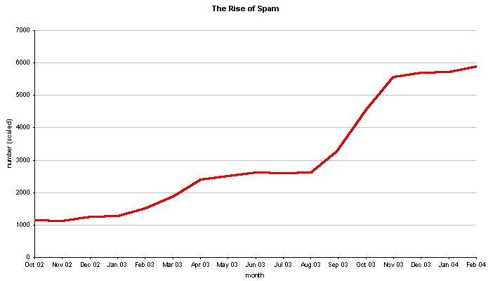
The graph shows the number of spam emails received to all of Stilgherrian's email addresses. Each month's figure has be scaled according to the length of the month, so that each represents a nominal 30-day month. The figures do not include email generated by viruses and other malware.
Copyright ©2004 Stilgherrian. All rights reserved. This graph may be republished in any medium free of charge, provided the following credit line is used: "Source: www.stilgherrian.com/spam"; if it's published online, that the source line includes a hyperlink back to this page, and I'm notified by email that you've used it; if it's published in any other medium, that a copy of the publication is sent to PO Box 103, Enmore NSW 2042, Australia.
For further information, please email stil@stilgherrian.com. I'd also be interested in seeing other people's data.