Rydges’ daft website contact form

Rydges contact form: click to embiggenThis week’s award for daft user interaction design goes to Rydges, the chain of hotels and resorts, for their incredibly silly website contact form.

Web contact forms can sometimes be useful, I suppose, if a business receives a lot of standard enquiries, because they can capture the structured data and put it straight into the customer relationship management (CRM) system. But most of these forms just dump the form data into an unstructured email, and dump that into some poor soul’s inbox. Why not just publish an email address? Are your spam filters that shoddy?

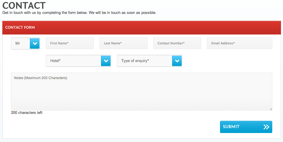
But when contact forms have badly-worded multiple-choice options, ill-thought-out data validation code, or unworkably small data fields, they make things difficult for everyone — and this one’s got the lot.

According to Rydges, you must have a title, but it can only be “Mr”, “Mrs”, “Ms” or “Miss”, not “Dr” or “Rev” or anything else. Your name must consist of two words. Your phone number cannot start with the “+” that comes before the country code, odd for an international business, nor may it contain spaces. And the “Type of enquiry” drop-down has only two choices, “Business” or “General”.

Is a question about the hotel restaurant’s opening hours, for example, “Business” or “General”, I wonder?

But the pièce de résistance is that the body text is limited to just 200 characters. That’s about 30-odd words of standard English text. Good luck with that.

Samsung’s website survey arsehattery

This week’s Golden Cow Award for Corporate Arsehattery goes to Samsung for this piece of meaningless bullshit in a survey asking about my experience using their website.

Now as background, I was after the technical specifications of the Samsung Slate Series 7 tablet PC, but couldn’t find them. There was no section or link labelled “specifications”. That’s a fail, I reckon. So I decided I would do the survey.

Like all such surveys, it asked the kind of questions that market research companies think are important, such as how soon I was thinking of buying, what competing brands I was looking at, and my demographic details. But this question caused me, literally, to laugh out loud.

Thinking of today’s website experience, how successful has the Samsung website been in conveying the following concepts of the Samsung brand?

And the concepts listed? Fresh, clean, inspiring, unique, interesting, elegant, contemporary, intelligent, engaging, bright, simple, relevant, upbeat, forward-thinking, charismatic, chic, unexpected, visionary.

WTF? Who the heck thinks in those terms when visiting a website? “Oh, I couldn’t find the technical specifications. This website just doesn’t convey the charismatic or chic brand values.”

I’d like to find whoever was responsible for this idiocy and ask them to define, in concrete web development terms, the three key differences between a brand experience that’s “fresh” rather than “clean” or “simple”.

And then I’d like to bury them in a ditch.

Links for 29 September 2009 through 30 September 2009

Stilgherrian’s links for 29 September 2009 through 30 September 2009, published with very little care whatsoever:

Links for 22 September 2009 through 26 September 2009

Stilgherrian’s links for 22 September 2009 through 26 September 2009, gathered intermittently and posted with a lack of attention to detail: