Prime Minister John Howard rides his white horse into Aboriginal Australia to save the kiddies. Yes, banning pornography will prevent child sexual abuse, apparently — despite a complete lack of evidence to support that idea. Despite the fact that whities committing sexual abuse against white kids won’t have pornography banned in their communities. And despite JWH being on the record as saying he’s opposed to censorship of any kind. Just how many ways can you be a complete hypocrite in the one news story?
Photos courtesy of a Nokia N80
I should mention that most of my photos I’ve been posting here lately have been taken with my Nokia N80 Nseries “multimedia phone”. Not too foul for a camera with a lens the size of a burst pimple.
The view from the hotel

For today’s strategic planning session, we booked the executive boardroom at Rydges North Sydney. This was our view. Remember, this is the middle of winter in Sydney. Hello, London. 😉
Test and compare your Internet speed
This is seriously fucking cool. Speedtest.net tells you the actual speed of your Internet link. So, for example, my 1500/256kb link with People Telecom (formerly Swiftel) currently delivers 1267/206kb. Not too shabby.
And even better, Crikey is now running the totally unscientific national broadband test — so send your results to boss@crikey.com.au. I’ll be very interesting to see what they discover… stay tuned!
[Update 20 minutes later: Actually, it’s not that cool. There’s a serious methodological flaw. The “compare your results” bit doesn’t take into account one important datum: the rated speed of your Internet link. For example, it shows the “New South Wales average” as 3680kb per second — but that’s over twice the rated speed of the link I have. Without scaling the results as “percentage of rated speed”, the comparisons are meaningless. Still, it’s a pretty site, and useful.]
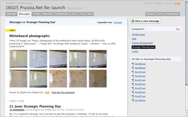
The aesthetic of Basecamp
I’m writing up my notes from today’s strategic planning session, and I was suddenly struck by the clarity of information design in Basecamp, our project communication tool. This really is one of the cleanest and most elegant user interfaces I’ve ever used.

Things of note about this screenshot:
- The content dominates the page, not some loudly-screaming logo or “web page header”.
- The hierarchy of the information is very clear. It’s immediately obvious which label is attached to which object, and what’s more important.
- It’s simple, easy on the eye — so you can work on this all day.
Which all makes it a fine example of Web 2.0 design.
Plus for some reason I really, really love the way the photos of the whiteboard make a lovely abstract pattern.
Stabbed, kept masturbating
A stab victim kept on masturbating, even though knifed twice in the shoulder. The Brisbane man, Daniel Peter Blair, took amphetamines and… well… read the story for yourself! (Hat tip to the Snarky Platypus.)

