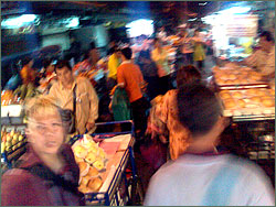
Just in case you’re wondering how I made the new header image on the website, I’ve used the same technique as the previous one. I’ve taken a slice from a semi-random photograph and stretched it.

The source image is a random (and not very good) photo I took in Bangkok’s Chinatown. In Photoshop, I took a one-pixel deep slice through the middle of the image somewhere, then stretched that out to create the vertical stripes. I then tweaked the contrast and saturation — but not the underlying colour hue — until I had a “pleasing” result.
The previous image was a slice through the girders of Sydney Harbour Bridge, with the grey evening sky in the background — the whole scene blurred by smoke.
I must admit, I’m quite attracted to impressionistic views of the world. That’s why I like Trevor Paglen‘s work.

