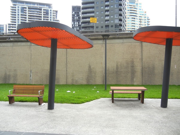
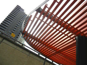
These architectural features on Cumberland Street in The Rocks, Sydney, look quite lovely I suppose — until you stop, look and think. Then you’ll realise they’re completely pointless. They’re an architectural wank. Wankitecture.
The things with the red canopies look like they’re some sort of, well, canopies to protect people from sun and rain. But they’re positioned such that they offer no protection whatsoever to the benches and picnic tables. No, the benches and picnic tables sit fully exposed to the elements. The only things the things with the red canopies protect are bleak patches of pavement.
But even if the things with the red canopies were positioned to offer such protection, look again! They’re just slats! They don’t actually offer any protection whatsoever!
I’m curious. Any highly-public architecture like this goes through so many layers of approvals, the plans are seen by so many sets of eyes — and yet no-one seems to have asked, “What the fuck are these things actually for?”
Is it simply a case of The Emperor’s New Clothes?
Actually, I do see that the things with the red canopies are positioned just to the north of the seating. At least the ones shown in the photo. Perhaps they’re positioned so that they do provide shade. During lunchtime. In summer.
But still, why not provide protection all day, all year round?
And why not provide protection from the rain?
If you know of any other examples of such wankitecture, do let me know. And if you’re the architect responsible for this one, “Please explain.”


These are merely modest and minor examples of a long history of “wankitecture” where form and aesthetics have been allowed to taint the rational, functional purity of structures. Take, for example, these other frivolous building from history, which must certainly qualify as “wankitecture”.
– Gaudi’s Basílica i Temple Expiatori de la Sagrada Família – I mean, c’mon. It’s a church. What business does a church have with fractal tree-like columns and fruit – fruit! – mosaics all over its 12 towers?
– Santiago Calatrava’s Turning Turso in Sweden. Twisting a building? Twisting it so every-single-fucking-window was differently shaped? He’s pulling our leg, surely.
– The Duomo di Milano. A hodgepodge of architectural styles, with countless manhours wasted on gargoyles and rosettes and other chiselled-stone nonsense, none of which serves the slightest practical purpose.
Oh. Wait. These are actually some of the finest buildings to ever have been built. Perhaps if we put reductionist definitions of architecture to one side, and let ourselves ponder the aesthetics and form, we might find something that’s not only functional (as you admit these are), but could possibly even be beautiful.
After all, there’s a reason why architects and engineers are separate careers.
@Jason Langenauer: Except all of the buildings you name manage to provide shelter from the elements all year round. It’s not that fucking hard to provide a… “roof”.
And those stupid canopies don’t even look nice. They look like giant toaster elements or upended branding irons. More NSW taxpayer money well spent…
I’m with Jason on this one… who says a building has to have a roof?
possibly one of the ugliest (but most interesting) pieces of public art in Canberra is ‘The garden of Australian dreaming’. It has almost no trees or plants, which for most would be the definition of a garden.
Canberra? Canberra!
takes discussion of “wankitecture” to a whole new level.
the slats can, if correctly angled and spaced, provide protection from the sun — typically this would be designed to provide maximum summer shade, while allowing full winter sunlight to pass through. they may be unappealing to your eyes (as it is to mine), but the critical aspect is whether they were properly designed and installed to offer useful shade. sadly, many designers and contractors don’t understand or care for the subtleties of passive solar design, without measurements it’s very difficult to tell — you may well have spotted some of the infinite examples of architectural folly, lacking in form or function.
@kazari: Well, a building doesn’t have to have a roof. But I reckon that if you’re going to provide shelter, it might as well be year round.
@krzystoff: Yeah, I get all that. But I still can’t help but think there’s an opportunity lost here. Shading the punters from the summer sun at lunchtime is one thing, but they could also have provided protection from the rain.
“why not provide protection from the rain?” a fair point.
I’m not familiar with Cumberland Street, but these seats and tables would have very few people would use them when it is raining, even if a rain cover was provided (smokers or homeless people might disagree); however if the space is a covered walkway, or a fully enclosed courtyard, then it would definitely want protection from rain.
Flickr user beachcomberaustralia has found an image of what this site looked like in 1901, well before the Sydney Harbour Bridge was built.