Is London 2012 skewing their blog commentary?

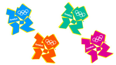
Yesterday I posted a comment about the dodgy logo at the London 2012 blog, but it wasn’t published. So this morning I’ve posted the following comment which may or may not appear.

I don’t understand why the balance of commentary on this blog is so out of kilter with the balance of commentary elsewhere. It’s clear that most media outlets are reflecting an overwhelmingly negative response to the new branding — yet that’s not reflected here.

I posted a comment on this issue on Monday’s posting but it wasn’t published — yet I don’t see how it broke the commenting guidelines.

Are comments being selectively published as a PR “spin”?

I wonder if they’ll even respond… there’s so much at stake with the Olympics, and so many reputations to protect.

London 2012’s crappy logo

There really isn’t a polite way of putting it, is there? This new branding for London 2012 (formerly known as the Olympic Games) is a shocker. How did they manage to get it so wrong?

Logo for the London 2012 Olympics

The Sydney Morning Herald headlined their story Olympic logo gets the thumbs down and referred to comparisons with “a disfigured swastika”.

But the Wikipedia entry has the best material so far. A reader of free newspaper London Lite pointed out a resemblance to Lisa Simpson performing oral sex.

A segment of animated footage released at the same time as the logo triggered seizures in people with photosensitive epilepsy. London 2012 removed the offending footage from its website.

How about you start?

I saw a guy’s profile online just now: “29 english need cash/work — ideas appreciated.” Well, mate, what do you think you can do that’s of value to someone else? Give us a clue! “Work” doesn’t just flutter down from heaven, not even under a Coalition government.