
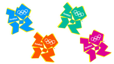
There really isn’t a polite way of putting it, is there? This new branding for London 2012 (formerly known as the Olympic Games) is a shocker. How did they manage to get it so wrong?
The Sydney Morning Herald headlined their story Olympic logo gets the thumbs down and referred to comparisons with “a disfigured swastika”.
But the Wikipedia entry has the best material so far. A reader of free newspaper London Lite pointed out a resemblance to Lisa Simpson performing oral sex.
A segment of animated footage released at the same time as the logo triggered seizures in people with photosensitive epilepsy. London 2012 removed the offending footage from its website.
Alex, Head of New Media at London 2012, has written a blog entry which completely fails to mention the adverse reactions to the logo while still making excuses for it.
And:
Well, a brand that somehow said “London” or “England” or “sport” or “global” might have been nice… I don’t see people exerting themselves to the utmost in the spirit of a fluoro pink somethingorother.
A Keith Haring design for ‘Mambo’ surf wear?
Some sort of Rorschach inkblot test?
If it’s the latter, God help me – because I see Lisa Simpson going down on a bloke.
‘I don’t see people exerting themselves to the utmost in the spirit of a fluoro pink somethingorother’
You never watched ‘Aerobics Oz Style’, did you?