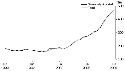
This graph (right) shows the massive rise in spending on minerals exploration in Australia over the last 8 years.
The graph comes from the Australian Bureau of Statistics report 8412.0 – Mineral and Petroleum Exploration, Australia, Jun 2007 released yesterday — although this specific graph doesn’t include petroleum.
They say:
The trend estimate for total mineral exploration expenditure increased by $22.3m (5.0%) to $470.8m in the June quarter 2007. The estimate is now 37.4% higher than the June quarter 2006 estimate.
The largest contributions to the increase this quarter were in Western Australia (up $17.1m or 7.8%) and South Australia (up $7.2m or 9.8%). New South Wales showed the largest decrease of $1.7m or 4.7%.
I suppose I should say something about this being an indicator of where all the money’s been coming from lately. But we all know this already, don’t we?


