
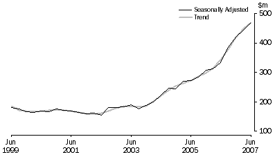
This graph (right) shows the massive rise in spending on minerals exploration in Australia over the last 8 years.
The graph comes from the Australian Bureau of Statistics report 8412.0 – Mineral and Petroleum Exploration, Australia, Jun 2007 released yesterday — although this specific graph doesn’t include petroleum.
They say:
The trend estimate for total mineral exploration expenditure increased by $22.3m (5.0%) to $470.8m in the June quarter 2007. The estimate is now 37.4% higher than the June quarter 2006 estimate.
The largest contributions to the increase this quarter were in Western Australia (up $17.1m or 7.8%) and South Australia (up $7.2m or 9.8%). New South Wales showed the largest decrease of $1.7m or 4.7%.
I suppose I should say something about this being an indicator of where all the money’s been coming from lately. But we all know this already, don’t we?
Actually Stil – if you wanna get technical, have a look at the graphs for the same period, but 1stly in USD Income, then AUD Income, then – if u can find it AUD per adjusted tonage.
What will probably stick out like dogs balls is that the actual Tonnages shipped have not increased markedly, it has all been about increase in the price of the stuff that we dig out.
We’re not being clever, or even shipping much more of it out, its just that out customers are more than happy to pay us shitloads more than they did 5 or 10 years ago!