How were my predictions for 2008?

The Christmas decorations are in the shops, people are having Christmas parties, the current affairs programs are off TV, so the year has ended, right? What do you mean, your calendar has something called “December”? Bah! This is the 21st Century! One-twelfth of the year is just thrown away!

Back in January I made some Predictions for 2008. Since 2008 has already ended, let’s see how I went.

Continue reading “How were my predictions for 2008?”

Clive Hamilton doesn’t quite win “Cnut of the Week”

Photograph of jet airliner tail with Qantas logo and Cnut of the Week title

I’m surprised. I thought that given Senator Conroy’s three-in-a-row victory as “Cnut of the week”, this week’s winner would be Clive Hamilton for his irrational rant in favour of Internet censorship in Crikey yesterday. But no.

Hamilton is certainly Cnutworthy, trying to hold back two strong tides of change: the change of the Internet, which will deliver whatever people want to send down its pipes, whether you try to block it or not; and the tide of rationality which increasingly renders shrill fear-mongering and name-calling irrelevant. But no.

The winner was Qantas for continuing to resist a tide of public opinion which clearly shows their reputation slipping thanks to unreliable service — which appears in turn to be the result of cuts to maintenance processes.

Last night’s episode of Stilgherrian Live is online for your viewing pleasure, though it’s not the same without the live chat.

But Clive Hamilton… Two hints, Clive.

Continue reading “Clive Hamilton doesn’t quite win “Cnut of the Week””

Echoes of America’s racial history

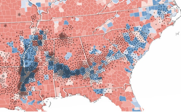
Map showing correlation between US cotton production in 1860 and votes for Barack Obama in 2008

Much has been said of the supposed racial element in the election of Barack Obama as the next President of the United States. This map shows how deep the historical roots run.

The base area map shows in blue the counties which recorded a majority of votes for Obama. The overlay dot map shows US cotton production from 1860 — each dot represents 2000 bales. The similarity of the distribution is uncanny a century and half later.

It’s worth reading the comments on the original post at Strange Maps as people attempt to explain the finer details.

Crikey: @KevinRuddPM stumbles into the Twitterverse

Crikey logo

[This article was first published in Crikey on Friday. It covers much the same material as my previous three posts [1, 2, 3] but for a general non-Twitter audience.]

Wednesday 1.35pm. Someone logs into the newly-created account “KevinRuddPM” and types “Looking forward to communicating with you on Twitter“. Thus did our Prime Minister enter the crazy hyperconnected global front bar cum water cooler conversation that is the Twitterverse.

Twitter avatar of @KevinRuddPM

It took a couple of hours for word to spread and for KevinRuddPM to gather his first ten “followers”. But soon the numbers grew. People said their greetings, asked questions and offered opinions — and most of the opinions were calling for an end to the Internet filtering trials. Smart-arses like me even offered snarky advice.

By mid-evening, KevinRuddPM had more than 700 followers. Those hanging out for a response eagerly devoured the second Prime Ministerial tweet: “Thanks to everyone for adding me on Twitter.” [My reaction: OMFG! Kevin Rudd tweeted again!] And then all the followers suddenly disappeared. Huh?

Continue reading “Crikey: @KevinRuddPM stumbles into the Twitterverse”