
According to the latest figure from the Australian Bureau of Statistics, Australia has just experienced its fastest population increase ever! In the 12 months ending March 2007, we saw 307,100 new residents, 46% through “natural increase” (porking, I assume) and 54% through net migration.
So this is what a resources boom looks like…
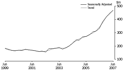
This graph (right) shows the massive rise in spending on minerals exploration in Australia over the last 8 years.
The graph comes from the Australian Bureau of Statistics report 8412.0 – Mineral and Petroleum Exploration, Australia, Jun 2007 released yesterday — although this specific graph doesn’t include petroleum.
They say:
The trend estimate for total mineral exploration expenditure increased by $22.3m (5.0%) to $470.8m in the June quarter 2007. The estimate is now 37.4% higher than the June quarter 2006 estimate.
The largest contributions to the increase this quarter were in Western Australia (up $17.1m or 7.8%) and South Australia (up $7.2m or 9.8%). New South Wales showed the largest decrease of $1.7m or 4.7%.
I suppose I should say something about this being an indicator of where all the money’s been coming from lately. But we all know this already, don’t we?
Australian Social Trends 2007
If you want to know what’s really going on in this country — as opposed to the spin — dig through the latest stats in Australian Social Trends 2007. Another fine product from the Australian Bureau of Statistics, one of the very few truly independent national statistical agencies.
Divorce rates down (a bit)
Australia’s divorce numbers have fallen for the fourth year in a row — although to look at the graph (total number of divorces granted in each year) it’s nothing to write home about.
Check the full report for some other fascinating insights.
25% Irrigated
Irrigated farms generate a quarter of Australia’s agricultural production, according to figures released today by the Australian Bureau of Statistics.
The gross value of irrigated production was $9 billion in 2003-04. Irrigated horticulture made up 52% of that, followed by irrigated pastures (24%) and irrigated broadacre crops (24%).
So what happens when global warming dries out the canals? $12/kg bananas will be remembered as the good times, and forget cheap wines from Mudgee.