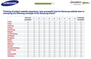
 This week’s Golden Cow Award for Corporate Arsehattery goes to Samsung for this piece of meaningless bullshit in a survey asking about my experience using their website.
Now as background, I was after the technical specifications of the Samsung Slate Series 7 tablet PC, but couldn’t find them. There was no section or link labelled “specifications”. That’s a fail, I reckon. So I decided I would do the survey.
Like all such surveys, it asked the kind of questions that market research companies think are important, such as how soon I was thinking of buying, what competing brands I was looking at, and my demographic details. But this question caused me, literally, to laugh out loud.
Thinking of today’s website experience, how successful has the Samsung website been in conveying the following concepts of the Samsung brand?
And the concepts listed? Fresh, clean, inspiring, unique, interesting, elegant, contemporary, intelligent, engaging, bright, simple, relevant, upbeat, forward-thinking, charismatic, chic, unexpected, visionary.
WTF? Who the heck thinks in those terms when visiting a website? “Oh, I couldn’t find the technical specifications. This website just doesn’t convey the charismatic or chic brand values.”
I’d like to find whoever was responsible for this idiocy and ask them to define, in concrete web development terms, the three key differences between a brand experience that’s “fresh” rather than “clean” or “simple”.
And then I’d like to bury them in a ditch.

 London 2012’s head of new media, Alex Balfour (pictured right) has just won points for his organisation! OK, they didn’t publish my comments on the