I thought this amusing video was going to be another send-up like the iPhone parodies I posted recently, but it’s actually something else again.
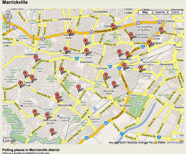
Polling booth maps clever, but whose map?
The NSW Electoral Commission has great interactive maps so you can find your local polling booth for 24 March. But they’re based on Google Maps. So as Richard Chirgwin points out, the mapping data is licensed in a very roundabout way.

The NSW Government street data is licensed to PSMA (the public sector mapping agency), which is then licensed to MapData Sciences, which is then licensed to Google Maps which is then licensed back to… the NSW Electoral Commission.
“We are surrounded by cretins,” Richard says. I tend to agree.
Though the defence is obviously that Google Maps provides a nice, convenient interface for programmers to use.
Ruddslide? Don’t count your chickens just yet
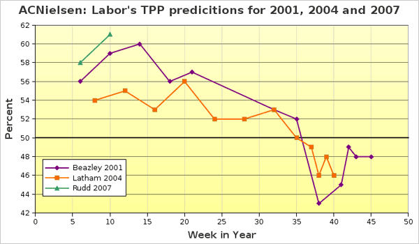
This morning’s Sydney Morning Herald predicted that the forthcoming federal election will be a landslide for the ALP’s Kevin Rudd. But this graph — showing the pattern of Labor’s two-party preferred poll results leading up to the last elections — suggests that it might be too early to claim that.

According to the oz politics blog, the source of this graph:
Headlines proclaiming that Howard’s spoiling strategy had failed are a little premature. Howard is playing a medium term game. It is the standard two pronged game: pander to the punters and slam the opposition at every possible turn. The effectiveness of Howard’s medium term strategy cannot be judged after a few short weeks. If previous election years are any guide, It was not until the middle of the year that a recovery trend (from Howard’s perspective) was evident. Howard only achieved positive polling territory from the middle to late in the third quarter of the year.
Only time will tell…
Interesting discussions…
… are kicking off in my posts about racism in an accommodation poster and The Greens’ chances of winning Marrickville. Do feel free to join in!
The Bush administration’s Must-Do List
The New York Times has just published, as their editorial, a list of things that need to be done to “reverse the unwise and lawless policies of President Bush and Vice President Dick Cheney.”
“The Death of Decency”
All I know about the movie Bobby is that it’s set in the USA at the time of Bobby Kennedy’s assassination. But I just heard writer-director Emilio Estevez say the most amazing things to Margaret Pomeranz.
