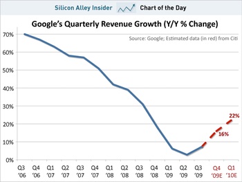
It’s no secret that the high-growth venture-capital-driven Internet industry is a hype-laden circus of misinformation. But today’s Chart of the Day from Silicon Alley Insider (right) really takes the biscuit.
Here we see that since Q3 of 2006, Google’s quarterly revenue growth has steadily declined from a cancerous 70% year-on-year to under 10% for the last three quarters.
Now there’s nothing wrong with an 8% growth rate. That’s pretty much up there with China, for instance. And the only countries growing faster than China are starting from a very low base. Think of such economic powerhouses as Angola, Bhutan, Rwanda and Timor-Leste.
OK, I know countries and companies aren’t the same thing, but that’s not my point.
Look at the bottom right of that first graph.
Citi reckons that Google’s growth in the next two quarters will increase in a more-or-less straight line that’s even steeper than that most recent quarter-on-quarter increase. Based on fucking what, Citi? That’s the only quarter showing growth in the entire chart!
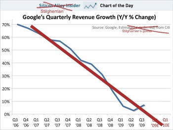
Surely this second graph is a more realistic projection based on the data available.
There’s precisely zero science here. I just grabbed the straight-line tool in my graphics program and drew in a red line by eye. I certainly couldn’t be arsed doing this properly with, you know, mathematics. But…
Honestly, which of these “projections” looks more realistic to you?
As I say, there’s no science here. Perhaps we can add some analysis.
What factors might be affecting Google’s potential for increased revenue growth?
On the plus side:
- Google is operating in a marketplace which is still growing, and perhaps even growing faster than last year as we emerge from the global financial crisis. Then again, so is everyone else.
- Google’s got a new product line coming out, those Android phone thingamabobs, and people are wetting themselves to get one. Well, at least until Apple reveals their new toy next week.
- Google pwns the Internet.
- What else?
But working against that:
- Google is subject to increased competition, especially from Microsoft’s Bing and related products and services.
- Rupert Murdoch is up to something, although admittedly he might not have the faintest idea what he’s doing.
- Every market eventually reaches a plateau. The key bullshit image of the first dot.com boom was the classic revenue projection of a start-up: exponential growth continuing forever. Well, here in rich white Western countries, all the folks who are using the Internet are pretty much there already. There might be more volume of data, but the amount of attention span you can sell to advertisers ain’t going to rise so much.
- What else?
We also need to remember that these are revenue figures, not profit. And that’s my core point. Simplistic “Oooh, aah!” gawking over one numerical measure without context is wankery. Why do we let analysts get away with it?
All that said, I’m no financial analyst. What would I know? So if you know better, set me straight. There’s a “Reply” box below…
Oh, and Google’s Q4 revenue figures will be announced tomorrow. So we’ll have one more real data point then. Stand by.


Actually I think if you re-visit this in July or so, you could well find that Citi was closer than you. Economy picking up etc etc.
Thing is, the insights from these kinds of “analyst” are more akin to racing tips than anything based on hard data.
@Simon Rumble: We shall see. I’ve just set a note-to-self to check Google’s revenue figures each quarter for the next… well, until I get sick of being embarrassed for being so wrong.
I’m in agreement with you, Stilgherrian. I’m willing to bet 1000 Internet Reputations that the next three quarters will be closer to 0% Y/Y growth than “double-digits”. We shall see tomorrow.
There needs to be a website dedicated to charts drawn by analysts and the actual reality a few quarters down the line. I asked an economist if they ever go back and check if their predictions are right, he said they didn’t. Awesome.
@simon rumble
Sure, the recession of 09 hit them, but the trend is a lot longer than 09 alone. Strong economy or not doesn’t change the overall trend
Isn’t a chart based on revenue growth dealing with rates of change and isn’t it the case that mathematicians use calculus when dealing with rates of change ?
This doesn’t appear to be a chart depicting revenue – but a chart depicting the rate at which revenue is changing (a rate of change).
I would anticipate that a chart of “revenue by period” would be much flatter than this chart (which deals with rates of change).
I spent quite a few months studying Technical Analyis as part of a Graduate Diploma of Applied Finance. Unfortunately I failed because I misread the wording of the exam paper which stated that the hypothetical investor was “long” in the investment being discussed wheras my assumption was that the investor was “short”. The exam paper asked me to offer advice to the investor based on several months of trading figures expressed as a graph. Whether the investor was long or short in the stock was crucial to any advice given with respect to buy or sell decisions the next day. (BTW: I passed a similar test from the safety of my own home but there I had time to read the question -sigh ! )
The most fundamental point I can raise is that nobody can predict the future based on the past – even though those accutely attuned to charting techniques (Technical Analysis) often base buy and sell decisions based on minute by minute trading figures.
I would suggest the graph is misleading given that it appears to relate to rates of change with regards to revenue rather than revenue itself.
There is a book that used to be on the market “How to lie with Statistics” and if you can get hold of it I would recommend it.
I don’t trust a Stilgherrian straight line. I believe Charles Dow (Dow Theory and all that stuff) would also frown on it if he were alive today. I hasten to add there are things referred to as momentum indicators, oscillators and head and shoulder formations in the highly subjective study of graphs.
Here’s a quick tutorial http://www.investopedia.com/university/technical/
@Bob Bain: you lost me a bit towards the end there but to address your initial thoughts:
– rates of change are as volatile as the underlying value
– values starting off a low base tend to exhibit initial high rates of change diminishing in the fashion of a log function
@Stilgherrian: I’d back a horse, ahem, results more in line with Citi for the next couple of quarters due to GFC-recovery factors. However the longer term trend will be more likely stabilisation at low levels, organic growth not driven by major technology or mindset shifts.
Ive always been ambivalent about charting alone as an indicator. Google’s management is stable but their marketplace is maturing. The rate of innovative products is slowing, please dont tell me that yet another phone convergence device is innovation. The rate of profit growth is directly related to innovation. They need new paradigm changing products to maintain the explosive growth.
Google’s 2009 fourth-quarter revenue totalled $6.67 billion, a 17 percent increase.
Looks like they did better even than the Silicon Alley Insider predicted
Oh dear, looks like Sillicon Valley UNDER ESTIMATED Googles Q4. While I agree with your point, sir, I think you’ll find there is more to Estimating future performance than drawing straight lines 😉 I’m sure Sillicon Alley also looked at the actual revenues over time, Googles reported forecast earnings and have some real time stats on what is happening in their market. If we only looked to the past to determine the future, DELL would still be kicking massive goals and Windows Mobile would be our Handset OS of choice.
OK, so Google’s quarterly revenue growth for Q4 2009 was 17%, and net profit was up fivefold. I was wrong.
Expectations must’ve been higher, though, ‘cos shares initially dropped 5%.
It’s been a hectic day. That’s all I’ll add for now. More later, including responses to comments.
Here’s a more comprehensive review
http://investor.google.com/releases/2009Q4_google_earnings.html
Net profit up fivefold ?
well, sorta but there is a line for the previous year
Impairment of equity investments (1,094,757) $1,094,757,000
which seemingly had a major effect in 2008
Add this back to the stated profit and then work out the increase in net profit – about 40% by my reckoning.
I’ve continued this conversation over at No, Stilgherrian’s financial projections are bullshit. Please comment over there.