OK, so I was wrong. Very wrong. And Citi was right, perhaps even conservative with their estimates of Google’s revenue turnaround.
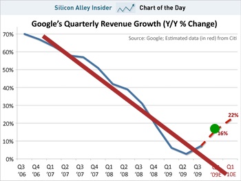
The other day I was sceptical that Citi’s analysis showed Google suddenly reversing three years of declining revenue growth. They predicted that the revenue growth for 2009 Q4 would be 16%.
I scoffed. I figured the fat red line (right) was a more appropriate projection of the data in the graph.
Well, Google’s actual Q4 revenue growth was 17%. That’s the green dot.
Bastards.
Now Bob Bain, who actually knows how to read these numbers, has found a more detailed review. He points out that while net profit was allegedly up fivefold, Google did write off a billion dollars as “impairment of equity investments” last year. I don’t know what that means, but it sure sounds like it’d make last year look a bit wobbly.
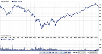
Now, check this chart of Google’s share price for the last two years.
Broadly speaking, it shows the share price dropping as the global financial crisis kicked in, and then recovering. Apart from that tiny little downturn in the last week or two, Google’s share price is back up to where it was two years ago.
Lessons?
- The stock market is a long term investment, unless you really want to immerse yourself in the crazy world of the day traders.
- When it comes to the stock market, I haven’t the faintest fucking idea what I’m talking about, and you should ignore me.
Any questions?


I also disclaim any clue about what I am talking about.
If you look at any stock or index ticker since the implosion of late 2008, they all show a steady linear growth with a lot less apparent volatility than much recent history. I do wonder if this is just the effect of trillions of dollars being pumped into the system by central banks and what happens when the inertial effects of the injection wear off — is the system just surviving for now on life support?
@Jon Seymour: I though the pumping had been done and now we’re getting the climb out of the hole? (Except in the UK, which is still fucked.) My completely uninformed response is that the market is being generally more cautious, less speculative and therefore less prone to acting on sudden whims. A guess.
@stilgherrian “impairment of equity investments”
An AFS equity investment is impaired when:
• its fair value has declined to below cost; and
• there is objective evidence of impairment
When this is deemed to be permanent (as opposed to a temporary impairment ) then the organisation holding the investment is obliged to write down the difference between the price paid and the current value of the investment.
In this case a billion dollars.
addendum to the reply above AFS = “Available for Sale”
Chart information can be obtained from NASDAQ :
http://www.nasdaq.com/aspx/chartingbasics.aspx
This appears to default to Microsoft. Replace MFST with GOOG (at the top) and it’s possible to examine the stock over various time frames. The default chart format is OHLC (Open, High, Low, Close) which is useful for determining the attitude of buyers and sellers on a particular trading day and is widely used in Technical Analysis. Selecting a 5 day time frame may help clarify this format. On the 22nd January for instance there was a marked difference between the high and low (the top and bottom of the OHLC graph). From memory the line at the left indicates the opening price and the line at the right the closing price. On this day the volume was relatively high but the share price was trading much lower than the previous day.
Analysts tend to compare price movement with moving averages which also feature on this page if a user wishes to select that option.
Charles Dow (who founded the Wall Street Journal — now owned by Rupert Murdoch) was a founder of this technique and together with one of his staff lent his name to the Dow Jones Industrial Index.
Nuff for now. 🙂
Confirming that on an OHLC (bar) chart the line on the left is the opening price, and the line on the right is the closing price. See:
http://www.incrediblecharts.com/technical/bar_charts.php
A trend is indicated by a series of Higher Highs and Higher Lows (bullish) or Lower Highs and Lower Lows (bearish)
If the closing price is towards the low for the day the sellers are in control. If the closing price is towards the high for the day the buyers are in control.
When the price of stock moves above a moving average the stock is bullish and it might be a buying signal. When the price of stock moves below a moving average the stock is bearish and it might be a selling signal.
MACD is a Moving Average Convergence Divergence Oscillator which can be used as a substitute for volume.
NUFF SAID METHINKS 🙂
@Bob Bain: Yes, quite a lesson for one day! It’s useful to have an overview “how to read” for this data. Mind you, “moving averages” make certain fundamental assumptions about the nature of the market and indeed the universe. Technical analysis has always seemed a bit smoke-and-mirrors to me — not that I’ve looked closely.